 Welcome back to the story behind the creative process that went into formulating and executing the cover art and design for my second Pandora Zwieback novel, Blood Reign. As I explained last time, it began with my commissioning of artist Bob Larkin to paint the cover art, using as a template a Tomb of Dracula magazine cover he’d done for Marvel Comics in 1979. But since the version I had in mind was going to replace the victim with Pan and Dracula with Lady Kiyoshi Sasaki, leader of Blood Reign’s House Otoyo vampire clan, and I knew that Bob was unfamiliar with the fashion style Kiyoshi favors—called Elegant & Gothic Lolita—I brought in Eliseu “Zeu” Gouveia, artist of the Pandora Zwieback comics and the graphic novel Lorelei: Sects and the City, to design Kiyohi’s look.
Zeu’s first attempt (which I showed you in the previous post) was good, but not quite what I was looking for, considering both Pan and Kiyoshi were wearing black, which meant the potential existed for the characters to “bleed together” into one giant mass when seen at a distance. Something was needed to separate the two, and Zeu’s solution was to give Kiyoshi a white blouse. Problem solved! After he tightened the pencil art and inked the final illustration, I sent it over to Bob, who popped it into Photoshop to add the sort of cliff edge and lightning bolts found in his Dracula painting. The result was what you see up top (click to enlarge).
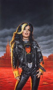
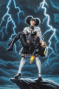 One change I asked Bob to make for the painting was to replace the heels on Pan’s boots with thick, flat soles, for three reasons: heels would be too impractical for all the adventuring (running, jumping, kicking, etc.) she’d be doing; thicker soles are her way of compensating for the fact she’s shorter than pretty much everyone around her; and Pan hasn’t mastered the art of walking on high heels—a scene in Blood Feud shows her wearing a pair of dressy pumps when she gets together with her friends, but spending most of her time wobbling around on them. She refuses to take them off because, well, she’s Pan. No stupid shoes are gonna show her who’s boss. But other than that, I told Bob, all systems were go for the painting. And, once again, when he delivered the final art he didn’t disappoint. (Of course, I knew he wouldn’t—that’s why I hired him.)
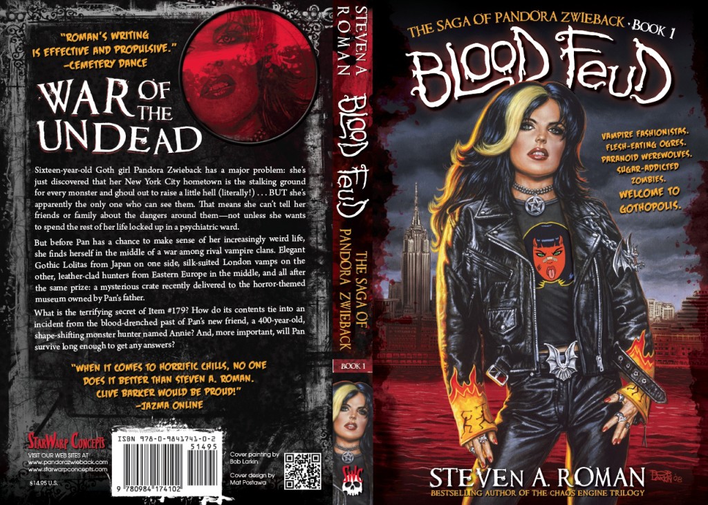
After that, it was just a matter of turning the art over to Mat Postawa, who’d set the tone for the series look with his design for the cover of the first Pan novel, Blood Feud. When all was said and done, the final cover came out as this:
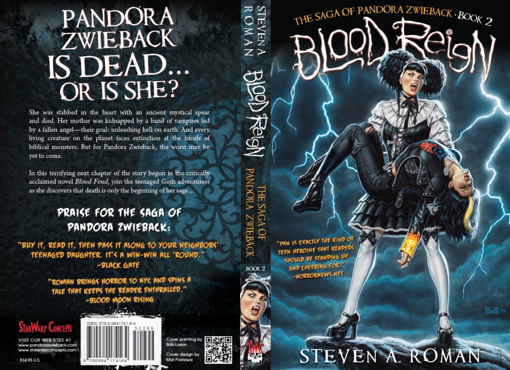 Spiffy, right? Just as Blood Feud’s cover design had touches of red to complement the “river of blood” in Bob’s painting for that book, Blood Reign’s played off the blue tones in the stormy sky. Of special note is the “devil girl” symbol on Pan’s T-shirt—a manga-influenced version of the one on Blood Feud’s cover—only this one was whipped up by Pan’s original designer, Uriel Caton! I’d asked Uriel to contribute to the process in some way, and once I saw this design I not only wrote it into the novel (as a T that Pan’s boyfriend, Javi, gives her), but also decided that a running joke in the books (and covers) could be that folks are always giving Pan devil-girl shirts (the first, in Blood Feud, was a gift from Mom)—which she has to wonder is meant to be a comment on her personality.
So there you have it: the VH1 “Behind the Cover” story of Blood Reign. And what about the werewolf-centric Stalkers, the third cover that Bob painted so I’d have a complete convention banner? Well, that got bumped to book 4 in the series, replaced by Blood & Iron, which will wrap up the vampire war storyline of Blood Feud and Blood Reign—and whose cover was painted by an artist named Candra. We’ll get to the stories on each of those covers when the time comes.
Next: We’re not done with the cover analyses just yet! Tomorrow I’ll show you what went into the creation of the cover for the recently published IndyFest Magazine #85—an illustration by artist extraordinaire Zeu that depicts the first-ever meeting of Pan and StarWarp Concepts’ first lady of horror, the succubus called Lorelei!
 Back on June 1st