Creating the Pandora Zwieback Annual Cover

Wrapping up our review of Pandora Zwieback covers, here’s the story of an illustration that was never intended to be cover art. But it looked too good to pass up when I got it in my head to publish The Saga of Pandora Zwieback Annual #1, a one-shot special that would feature three original stories: Pan’s first comic book adventure, by me and artist Eliseu Gouveia; a Pan short story, by me; and an eight-page “Tale of the Paniverse” (my term for events set in the same version of Earth as the one presented in the Pan novels—it’s a comic book thing) by friends Sholly Fisch (currently the writer of Scooby-Doo Team-Up) and Ernie Colon (a legendary artist whose lengthy credits include Amethyst, Princess of Gemworld and Richie Rich).
still_a_happy_goth_by_liesterIn 2011, as I was gearing up for the release of Blood Feud, the first Pandora Zwieback novel, I considered ways to attract attention to this momentous occasion in publishing history, and eventually came up with the idea for an art gallery featuring Pan. But it wouldn’t just be any sort of art gallery, it would be “The 13 Days of Pan-demonium,” during which thirteen commissioned artists would present their unique takes on SWC’s latest leading lady. (As it turned out, only twelve artists wound up being commissioned, with me ending up as the thirteenth contributor.)

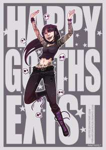
The first artist I approached was Henar Torinos, whose manga-influenced gothy style grabbed my attention during a search for “happy Goths” in the online art community deviantArt. Henar’s art came up first, mainly because she had two pieces on display: “Happy Goths Exist” and “Happy Goths Still Exist” (which you see to the left). It was the joy expressed in that second piece that caused me to e-mail Henar about the 13 Days project, and include a link to the digital version of the Saga of Pandora Zwieback #0 comic. She immediately got back to me with a yes, and asked what I had in mind. I told her I was looking for her interpretation of Pan—as long as she stayed on-style with Pan’s design, and left an open space for the inclusion of the Blood Feud cover, I wanted her to be the one to come up with something amazing. And did she ever!
pandora rockslowLG

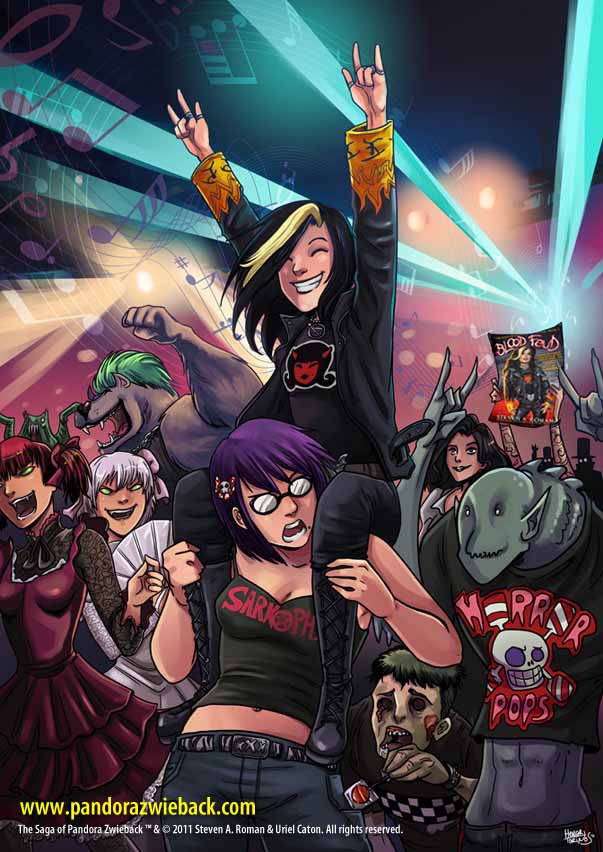
Titled “Pandora Rocks!” it has Pan sitting on the shoulders of her best friend, Sheena McCarthy, while they attend a concert (perhaps one put on by their favorite death-metal band, Sarkophagia?), while Pan’s immortal mentor, Sebastienne “Annie” Mazarin, looks on. And check out the monsters! And once webmaster Dave de Mond had Photoshopped the Blood Feud cover onto a blank sign Henar had placed in the background, it was ready for its Internet debut.

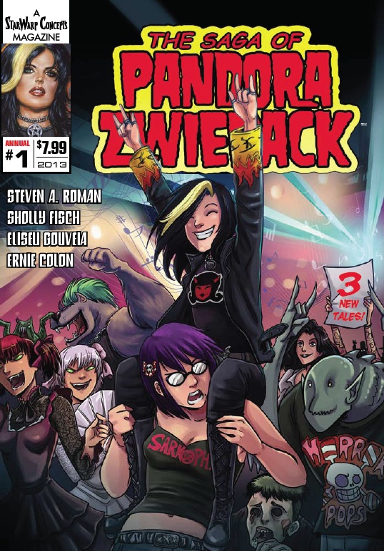
Then in 2013, I decided to do the Pan Annual—but what could I use for the cover? I considered commissioning a new drawing, but then I looked at the 13 Days illustrations and thought, Why not repurpose Henar’s art? That colorful, manga-ish, happy piece was certain to catch the eye of prospective comic book buyers. So I e-mailed her an offer to reproduce the illustration as a cover, and she agreed to it. From there I handed the design process over to Mike Rivilis, who, in no time at all, turned out the final cover:
SWC_PanAnnual01

That’s a great-looking cover!

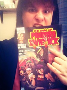
henar-torinos-pan-annualAnd who was the happiest Goth of all, when the published comic debuted? Why, Henar Torinos herself!

By the way, The Saga of Pandora Zwieback Annual #1 is still available for purchase in print and digital editions—just visit its product page at StarWarp Concepts for more information, including sample pages.

Creating the Pandora Zwieback #0 Cover, Part 2

As you’ll recall, yesterday I was telling you the story behind the cover for what became a revitalized StarWarp Concepts’ first release in 2010: the promotional giveaway The Saga of Pandora Zwieback #0, which was intended to introduce readers to Pan and her forthcoming literary debut in the novel Blood Reign. I’d scripted the seven-page story in which Pan would speak directly to readers, leading up to a sales pitch for Blood Feud that required Pan to hold up a copy of the book (the cover for which would be digitally inserted).

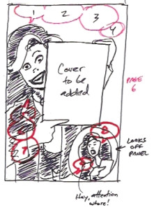
Pan0-rev-sketchBut when the artist I’d hired, Eliseu “Zeu” Gouveia, e-mailed his pencils for the story, the sales-pitch page had been replaced with an image of Pan and her monster-hunting mentor, Annie, gleefully running through a gauntlet of monsters. A revision would be necessary—which meant it was time to break out a marker and sketch what Pan was supposed to be doing, so Zeu would have a clearer understanding of my intention with that page.

What you see here is just…tragic. There’s a reason I focus more on my writing than my drawing. 😀 But it was good enough to show Zeu what I was looking for, and you’ll find the final version of page 6 in the comic. As for what to do with the rejected page…

“Y’know what?” I wrote to Zeu. “Don’t trash those pencils—because I think we’ve got our cover art here!

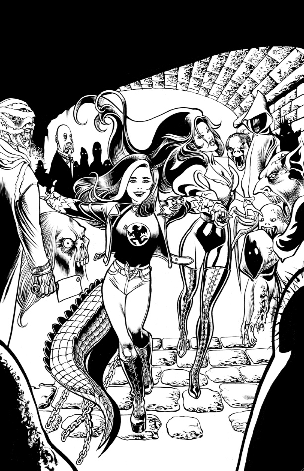
That’s right—it might not have been the page I was looking for, but it turned out to be the perfect cover image! So I told Zeu to ink the piece, and soon enough I was looking at this:

Pan0-CvrInks

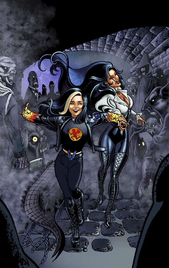
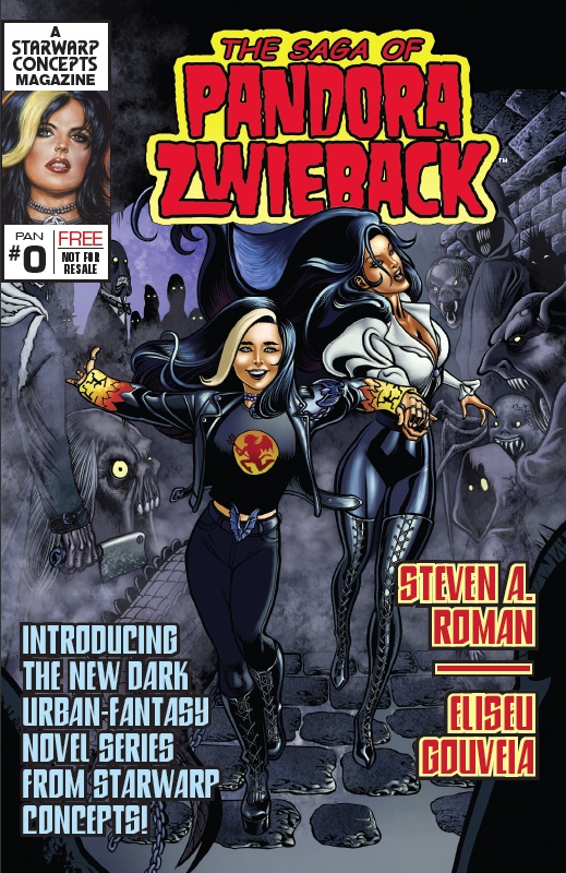
Perfect! And when I gave him the go-ahead to color it, this was the result:

Pan0-finalart

Now that’s cover art! The next step was to involve the comic’s designer and letterer, Mike Rivilis, a talented book designer I used to work with back in my editorial days at ibooks, inc. and Byron Preiss Visual Publications. (For SWC, he also designed and typeset the illustrated classic Carmilla, designed the graphic novel Troubleshooters, Incorporated: Night Stalkings, and designed and lettered the graphic novel Lorelei: Sects and the City and The Saga of Pandora Zwieback Annual #1.) I explained to Mike what the comic was for, and what design elements were needed—like lettering the seven-pager and typesetting sample chapters from Blood Feud in the back of the comic—and I gave him a rough idea of how the front cover should turn out.

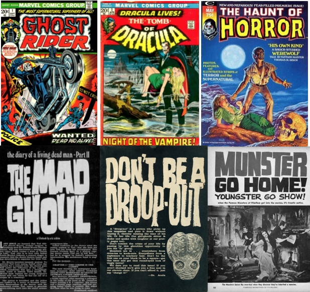
There was one thing missing, though: a Saga of Pandora Zwieback logo. For the Pan novels, designer Mat Postawa simply has the series title arc across the front cover, in a traditional font, and hand-draws the titles. The comic, however, would require an actual title treatment. So I turned to the one artist I knew who had decades of experience in creating comic and book titles: Bob Larkin, cover painter of the Pan novels Blood Feud and Blood Reign. I wanted an old-style horror logo, so I sketched out what I had in mind and explained to Bob that I was looking for something along the lines of the lettering styles used for articles in the classic horror magazine Famous Monsters of Filmland and the logos of Marvel horror comics of the 1970s:

Horror-Title-Lettering

Not surprisingly, he immediately understood what I was looking for—we’re both old-school horror fans (that Haunt of Horror cover painting is one of Bob’s, in case you hadn’t guessed)—and a day or two later he sent over his take, which I thought was perfect. I forwarded it to Mike, who was just wrapping up his design and lettering work on the comic’s interiors, and soon enough we had a finished cover:

Pan0-finalcvrNice, huh? And it all started with the happy accident (as the late painter Bob Ross would say—we don’t make mistakes, we have happy accidents) of Zeu drawing the wrong image for the Blood Feud sales-pitch page. It’s great when things just work out, isn’t it?
By the way, The Saga of Pandora Zwieback #0 is still available for free download—I ran out of print copies a few years back—so just click on the cover link you see in the right-hand sidebar and snag your own copy of this (now) digital comic.

Creating the Pandora Zwieback #0 Cover, Part 1

Sometimes a cover idea immediately pops up when you’re putting together a book, comic, or graphic novel—as you’ve witnessed in my previous posts, outlining the process involved in putting together the covers for the Pandora Zwieback novels Blood Feud and Blood Reign, and the cover for IndyFest Magazine #85. Other times, you just kind of stumble into one, as in the case of The Saga of Pandora Zwieback #0

Around mid-2010, I’d decided that I’d make the announcement of StarWarp Concepts’ triumphant return to publishing at New York Comic Con, that annual geekfest held in October. But rather than just set up a booth and hand out bookmarks and catalogs promoting the company’s upcoming titles, for Pan I wanted to go an extra step to really get some attention: StarWarp Concepts was going to publish its first comic book in eight years—and it was going to be a giveaway. But first, it needed an artist.

I’d just worked with a Portuguese artist named Eliseu “Zeu” Gouveia on a proposed revival of my succubus character, Lorelei—and one of these days you may get to see those pages—so I e-mailed him and asked if he’d be interested in this new project. Well, of course he was! And he could deliver final art and digital color by the deadline I gave him. What he needed, though, was a script, so I got to work on my part of the job.

Here’s where the unexpected cover comes in. With the script delivered, Zeu started penciling pages, one of which involved Pan making a sales pitch for Blood Feud directly to the comic’s readers:

PAGE 6
PANEL 1: LARGE PANEL (so we can fit in the important information about the book). Pan holds up a copy of Blood Feud [a Photoshopped insert of the cover image] next to her head so we can all get a good look at the cover.

1. PAN: PRETTY WILD, HUH? AND THE FUN ALL STARTS IN THE FIRST NOVEL:

2. DISPLAY TYPE: BLOOD FEUD: THE SAGA OF PANDORA ZWIEBACK, BOOK 1

3. PAN: THAT’S WHERE ANNIE AND ME WIND UP IN THE MIDDLE OF A WAR AMONG RIVAL VAMPIRE CLANS, WITH THE SAFETY OF THE WHOLE WORLD AT STAKE! (no pun intended)

4. PAN: IT GOES ON SALE [Date to be inserted].

5. PAN: IN THE MEANTIME, YOU CAN ORDER A COPY BY USING THE COUPON ON PAGE 8 OF THIS COMIC, OR BY VISITING MY WEB SITE

6. DISPLAY TYPE: WWW.PANDORAZWIEBACK.COM

7. PAN: WHERE YOU’LL ALSO FIND ALL THE LATEST NEWS ABOUT MY BOOK SERIES!

PANEL 2: A smaller, inset panel near the bottom right-hand corner of the page. Pan, interrupted in the middle of her sales pitch, looks off-panel at a voice calling to her.

8. PAN: AND DON’T FORGET TO VISIT MY PUBLISHER’S SITE, STARWARPCONCEPTS.COM, TO CHECK OUT THEIR OTHER PROJ—

9. SHEENA: (off-panel) HEY, ATTENTION WHORE!

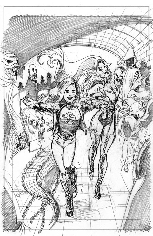
But when Zeu e-mailed jpegs of his penciled pages, what I saw instead for page 6 was this:

Pan0-CvrPencils

Which, as I’m sure you’ll agree, is an awesome image of Pan happily running toward danger and dragging Annie along with her, and which perfectly sums up my approach to Pan, who as a horror fan is thrilled to go on horror-related adventures…but it wasn’t an image of Pan doing her best impression of a huckster selling Blood Feud to the masses.

A revision would be needed…

To Be Continued!

Pandora Zwieback: Creating an IndyFest Magazine Cover

At the start of this month, Dimestore Productions released IndyFest Magazine #85, the latest issue of their monthly spotlight on independent publishing, music, filmmaking, and other topics. IndyFest #85 features a profile of StarWarp Concepts and yours truly, and cover art by Eliseu “Zeu” Gouveia, with whom I’ve collaborated on The Saga of Pandora Zwieback #0, The Saga of Pandora Zwieback Annual #1, and Lorelei: Sects and the City—and which you can download for free from the IndyFest site. (So what’re you waiting for? Go snag a copy!)

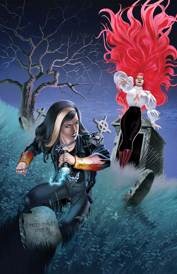
A few months back, I e-mailed IndyFest’s publisher, Ian Shires, and asked if he’d be interested in interviewing me for an upcoming issue, so that I could spread the word about StarWarp Concepts and the Pandora Zwieback series. Ian—having been a fellow small-presser back in the day when we each produced photocopied, hand-stapled comics—remembered me and, especially, remembered my succubus character, Lorelei, so he said he’d love to run a feature article if I could provide him with artwork for the issue’s cover—say, an art reproduction from one of SWC’s books. I said, “I’ll do you one better: how about an original illustration of Pan and Lori crossing paths?” Naturally, Ian liked the idea.

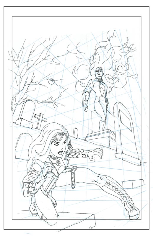
So I contacted Zeu, explained the situation, and said, “I don’t have anything specific in mind; maybe a cemetery setting? Just take your best shot at coming up with something.” The result was this:

IndyFest cover1I couldn’t help but grin. Cover images of old issues of Marvel Team-Up and Marvel Two-in-One—Marvel Comics series starring, respectively, Spider-Man and the Thing (from the Fantastic Four), who got together every month with a special guest star (Daredevil, Iron Man, the Black Widow, etc.) to fight bad guys—popped into my head. This was exactly the sort of dramatic image I was looking for!
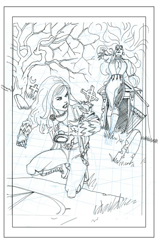
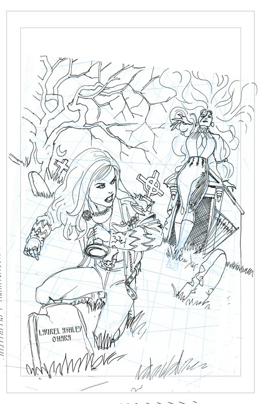
However, a bit of tweaking was required. Having taken a look at previous issues of IndyFest, I noticed they always placed their oversized EAN box and issue number in the lower right-hand corner. I thought maybe the magazine’s designer could shift them a little to the left so that Pan’s leg could straddle the number and box, but then Zeu solved the problem with an updated sketch.

IndyFest cover2

Why, this one worked even better! Now it was an image with a story to it—or at least a story that suddenly hit me. I e-mailed Zeu and said, “Hey, that crypt Pan is kneeling on? Can you put the name Laurel Ashley O’Hara on it? That’s Lori’s real name, so it’ll look like Pan’s investigating the grave and Lori’s not too happy about some gothy Nancy Drew poking around.” So Zeu made adjustments, and…

IndyFest cover3

Sold! I gave him the go-ahead, and before you knew it, I had the finished art:

Pan-Lori

Spectacular! There was room at the top for the magazine logo, the bottom right-hand corner had plenty of space to accommodate the EAN box and issue number, and room for cover copy on the upper left and lower right, without the need to run text over either Pan or Lori. So I passed it along to IndyFest and, at the beginning of June, when the issue was published, I saw…er…this…

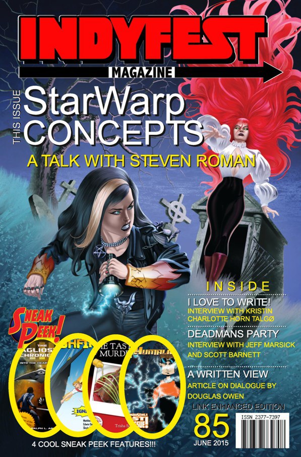
IndyFest85-cvr

Hm. Well, that was disappointing. I knew the IndyFest logo was going to be placed over Lori’s hair, but that’s sure a lot of text and large-size letters on that cover—and don’t think I missed that my name is used to cover Lori’s cleavage. And what’s with the call-out images covering the bottom left-hand corner—and Lori’s headstone?

The first thing I did, after putting the word out that the issue was available for download, was contact Zeu and apologize for how all his hard work turned out, because I felt awful about it.

But it has given me an idea for a Pandora Zwieback & Lorelei crossover comic that would display this cover art in all its proper glory… 😀

Next: My spur-of-the-moment Salute to Cover Designs Week celebration continues tomorrow with a look at the process behind the cover for The Saga of Pandora Zwieback #0. Join me, won’t you?

Pandora Zwieback: Creating Blood Reign’s Cover, Part 2

Zeu-Pan2TonedWelcome back to the story behind the creative process that went into formulating and executing the cover art and design for my second Pandora Zwieback novel, Blood Reign. As I explained last time, it began with my commissioning of artist Bob Larkin to paint the cover art, using as a template a Tomb of Dracula magazine cover he’d done for Marvel Comics in 1979. But since the version I had in mind was going to replace the victim with Pan and Dracula with Lady Kiyoshi Sasaki, leader of Blood Reign’s House Otoyo vampire clan, and I knew that Bob was unfamiliar with the fashion style Kiyoshi favors—called Elegant & Gothic Lolita—I brought in Eliseu “Zeu” Gouveia, artist of the Pandora Zwieback comics and the graphic novel Lorelei: Sects and the City, to design Kiyohi’s look.

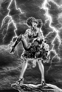
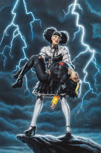
Zeu’s first attempt (which I showed you in the previous post) was good, but not quite what I was looking for, considering both Pan and Kiyoshi were wearing black, which meant the potential existed for the characters to “bleed together” into one giant mass when seen at a distance. Something was needed to separate the two, and Zeu’s solution was to give Kiyoshi a white blouse. Problem solved! After he tightened the pencil art and inked the final illustration, I sent it over to Bob, who popped it into Photoshop to add the sort of cliff edge and lightning bolts found in his Dracula painting. The result was what you see up top (click to enlarge).

BloodReign_ArtOne change I asked Bob to make for the painting was to replace the heels on Pan’s boots with thick, flat soles, for three reasons: heels would be too impractical for all the adventuring (running, jumping, kicking, etc.) she’d be doing; thicker soles are her way of compensating for the fact she’s shorter than pretty much everyone around her; and Pan hasn’t mastered the art of walking on high heels—a scene in Blood Feud shows her wearing a pair of dressy pumps when she gets together with her friends, but spending most of her time wobbling around on them. She refuses to take them off because, well, she’s Pan. No stupid shoes are gonna show her who’s boss. But other than that, I told Bob, all systems were go for the painting. And, once again, when he delivered the final art he didn’t disappoint. (Of course, I knew he wouldn’t—that’s why I hired him.)

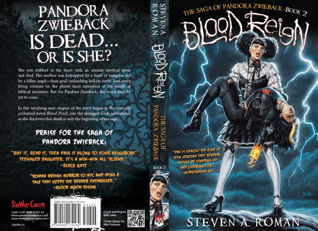
After that, it was just a matter of turning the art over to Mat Postawa, who’d set the tone for the series look with his design for the cover of the first Pan novel, Blood Feud. When all was said and done, the final cover came out as this:

BloodReign-FinalCvrSpiffy, right? Just as Blood Feud’s cover design had touches of red to complement the “river of blood” in Bob’s painting for that book, Blood Reign’s played off the blue tones in the stormy sky. Of special note is the “devil girl” symbol on Pan’s T-shirt—a manga-influenced version of the one on Blood Feud’s cover—only this one was whipped up by Pan’s original designer, Uriel Caton! I’d asked Uriel to contribute to the process in some way, and once I saw this design I not only wrote it into the novel (as a T that Pan’s boyfriend, Javi, gives her), but also decided that a running joke in the books (and covers) could be that folks are always giving Pan devil-girl shirts (the first, in Blood Feud, was a gift from Mom)—which she has to wonder is meant to be a comment on her personality.

So there you have it: the VH1 “Behind the Cover” story of Blood Reign. And what about the werewolf-centric Stalkers, the third cover that Bob painted so I’d have a complete convention banner? Well, that got bumped to book 4 in the series, replaced by Blood & Iron, which will wrap up the vampire war storyline of Blood Feud and Blood Reign—and whose cover was painted by an artist named Candra. We’ll get to the stories on each of those covers when the time comes.

Next: We’re not done with the cover analyses just yet! Tomorrow I’ll show you what went into the creation of the cover for the recently published IndyFest Magazine #85—an illustration by artist extraordinaire Zeu that depicts the first-ever meeting of Pan and StarWarp Concepts’ first lady of horror, the succubus called Lorelei!

Pandora Zwieback: Creating Blood Reign’s Cover, Part 1

Yesterday, I finished up the story behind the creation of the cover for the first Saga of Pandora Zwieback novel, Blood Feud. It was fairly simple in construct: I did a sketch of what I was looking for, handed it off to painter Bob Larkin, and he took it from there. Once Bob had delivered the final art, it went to designer Mat Postawa, who crafted the final look of Blood Feud’s cover. For the second novel, Blood Reign, however, I wanted something a bit more storytelling in its imagery—something that would end up making it a two-artist situation.

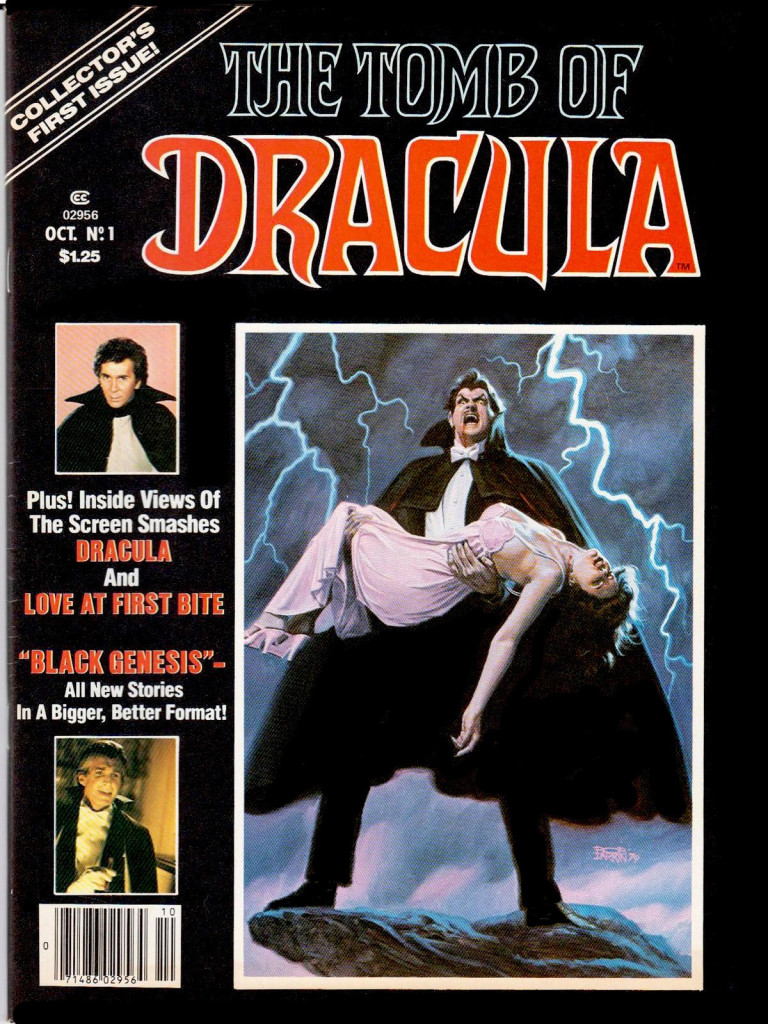
Now that the heroine’s-first-issue cover approach had been taken care of by using it for Blood Feud, the idea this time around was to create a dramatic image that would catch the eye of potential book buyers and entice them to explore the novel behind the cover. Of course, Bob Larkin was going to paint this cover, too, so I knew the final results would be amazing—but what, exactly, was I looking for him to paint? And then I remembered a first-issue cover that Bob had painted for Marvel Comics’ Tomb of Dracula magazine, back in 1979.

Tomb_of_Dracula1

The composition was exactly what I wanted, so I did what any smart-thinking publisher would do: I asked Bob to knock off the Dracula painting for Blood Reign. 😀 Just substitute Dracula with Lady Kiyoshi Sasaki, leader of Blood Feud’s Japanese vampire clan, House Otoyo, and replace the damsel in distress with Pan. Bob was okay with that, and was prepared to start sketching, but then I realized something: Since Kiyoshi’s wardrobe, as well as that of her entire clan’s, was based on Elegant & Gothic Lolita fashion—think nineteenth-century clothing with a modern-day twist, popular with not just Japanese youth, but American cosplayers—I’d be asking Bob to try and figure out a clothing style he’d never heard of, and be accurate about it so the image wouldn’t annoy Goth Lolis (as they’re known). My solution? Get another artist to design Kiyoshi and her dress, and then have Bob use that for the painting.

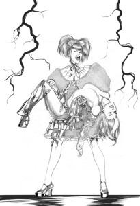
ZeuPanCvrEnter: Eliseu “Zeu” Gouveia, then-artist of The Saga of Pandora Zwieback #0, the free comic that introduces readers to Pan’s world (and still available for download; just click the link to obtain your own copy). Being something of a manga and anime fan, Zeu immediately understood what I was looking for, and soon enough came up with a design for Kiyoshi that he incorporated into the sketch you see here (click to enlarge), based on Bob’s Tomb of Dracula cover. A good start, but I thought the top half of Kiyoshi’s outfit was too oversized—she kinda looks like she’s wearing football shoulder pads—and that her all-black clothes set against Pan’s all-black clothes would be hard to see at a distance. Also, I wanted her looking forward; having her head turned sideways just raises the question “What’s she supposed to be looking at?”

So Zeu went back to the literal drawing board for a second-round sketch…

Next: The exciting conclusion to this pulse-pounding tale of cover artists and Gothic Lolitas!

Pandora Zwieback: Creating Blood Feud’s Cover, Part 2

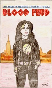
BFeud-LarkinBack on June 1st I told you about the start of the creative process behind the cover art for Blood Feud, the first Pandora Zwieback novel: I commissioned painter Bob Larkin to bring Pan to four-color “life,” then sketched out what I was looking for, and not too long after Bob delivered a final sketch that I approved. And then I realized that the bloody smiley face image on Pan’s T-shirt would have to be redesigned, or potentially risk drawing the ire of a French company that’s owned the smiley face trademark since 1972. But what could replace that iconic image? Well…what about a brand-new image?

So I pulled out my drawin’ pencil again and started sketching. I wanted to retain some elements from Uriel Caton’s design, so the Band-Aid across the “nose,” the crosshatched bruise, and the stuck-out tongue stayed; now I just needed a face to put them on. Then the idea struck me: how about the head of a devil girl? Bright-red skin and horns, a pageboy hairstyle, and bright-green eyes would go really well with those “I just got in a fight, so what?” elements. In no time at all I had a design I liked, and e-mailed it to Bob for him to give it a professional finish. Thus was the Official Pandora Zwieback T-shirt born! (Which, by the way, you can purchase from the StarWarp Concepts webstore.)

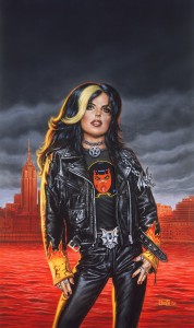
Blood-Feud-PaintingNow it was on to the actual cover painting, and when Bob was finally able to clear his busy schedule he got right to work, and the result is what you see here. Nice, huh? I had just one problem with it: there was too much red in the background. The concept I’d handed to Bob was that the Hudson River behind Pan—we’re looking at Manhattan’s West Side from New Jersey, for those who were wondering—was supposed to be a river of blood; making the skyline just as red worked against it. Bob’s rationale was that sunlight reflecting off a bloody river would “paint” the buildings red, which I could understand, but still…no. I’d rather have the bloody Hudson made as unsubtle as possible.

So I turned to Mat Postawa, the series’ book designer (and part-time metal head), to ask what could be done. Like Bob, I’ve known Mat—and SWC’s other genius book designer, Mike Rivilis—for years, having worked with him in the trenches of publishing house ibooks, inc., when I was its editor-in-chief. As I explained to Mat, for the Pan series I wanted a distinctive look for the cover designs that would appeal to both teenagers and Goths, but would also draw the eye of a general book buyer curious about the novel’s content. “You’re already familiar with the kind of audience I’m trying to reach,” I told him. “So take your best shot. And, uh, can you do something about those red buildings in the background?”

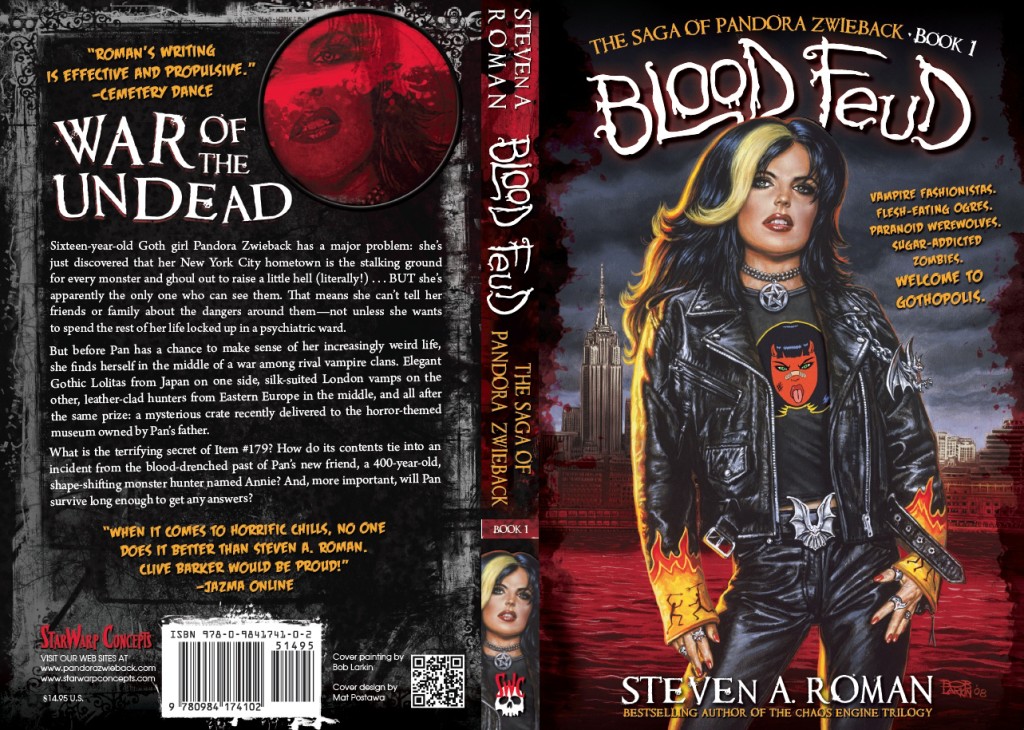
After a few rounds of give-and-take, each one better than the last, this was the look we settled on:


BloodFeudFinal

You couldn’t ask for a better cover! Mat adjusted the buildings’ color; deepened the background and added a hint of blood splash to the edges to make Pan stand out brighter; and even hand-lettered the Blood Feud title. Having Pan on the spine was my idea—for any self-publishers out there, it’s always good to keep in mind that your book might show up spine-out on a store’s or library’s shelves, so an eye-catching graphic is essential. I also wrote the back cover copy, and thanks go out to Mike Rivilis, who, after looking at the first-pass design, remarked that I’d overwritten the copy—there were originally four paragraphs. And since Mike has a long history of designing covers for young adult novels (two examples being Daniel Parker’s Countdown and Francine Pascal’s Fearless series), I listened when he said there shouldn’t be more than three paragraphs on a YA cover. He was right—it makes for punchier text.

“Lock it in!” I told Mat. “This one’s a keeper!”

So, there you have it: the story of Blood Feud’s cover, from first sketch to final design—just as action-packed as you’d expected it to be, right? 😉

Next: Creating the cover for Blood Reign, the current novel in Pan’s saga.

Pandora Zwieback: Creating Blood Feud’s Cover, Part 1

Wow, talk about getting sidetracked! When I wrote the introductory post for this discussion of cover designs, back in March, I didn’t know I was going to about to get caught up in a ton of freelance assignments, mixed with a barrage of promotional work (interviews, mailing out press kits and review copies, etc.) to help get the word out on Blood Reign: The Saga of Pandora Zwieback, Book 2 (on sale now, of course). Let’s recap and pick up where I left off, okay?

In 2008, I’d decided to resurrect StarWarp Concepts after an absence of three years, and turn the company into a book-publishing house, rather than just a home for my comic projects. It also meant a switch in a company focus from the Mature Readers character Lorelei—a succubus I’d created in 1989, and the star of SWC’s first comic series—to something more inclusive of a wider readership. To do that, the first project for the revived SWC would be The Saga of Pandora Zwieback: a young-adult, dark-urban-fantasy novel series I’d shopped around to major publishers for a couple of years, with no success. I still had plans for Lorelei, and for adding more titles to the budding release schedule, but Pan was going to be the new face of The ’Warp—and she was going to make her debut at the 2010 New York Comic Con, where I’d let the world know that StarWarp Concepts was back, better than ever.

There was just one thing, though: I needed a graphic to show off to the con-goers; I needed a banner to hang from the back of the booth. But in order to fashion that banner, I needed images to display—specifically Pandora Zwieback images. Which meant that first I’d have to commission cover art for books 1–3 in the series: Blood Feud, Blood Reign, and (originally) Stalkers. And there was only one artist I had to mind to tackle that assignment: Bob Larkin.

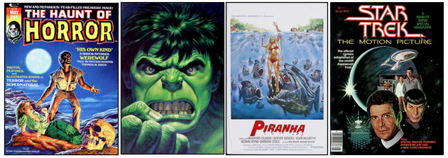
If you’ve been reading this blog for a while, by now you should be familiar with Bob Larkin—I’ve certainly written about him often enough! But if you’re still unfamiliar with his work, here’s a small sampling of what he’s painted:

LarkinArt02

Marvel Comics: covers for Dazzler, Star Trek: The Motion Picture, Star Wars, Episode V: The Empire Strikes Back, Close Encounters of the Third Kind, Jaws 2, Battlestar Galactica, Savage Sword of Conan the Barbarian, Tomb of Dracula, Haunt of Horror, Planet of the Apes, Crazy, and The Hulk!

Warren Publishing: covers for Creepy, Eerie, Famous Monsters of Filmland, The Rook, Warren Presents: Pantha the Panther Girl, and Vampirella

New World Pictures, Pathé, TriStar Pictures, Troma Studios, United Artists: movie posters for Heaven’s Gate, Humanoids From the Deep, Night of the Creeps, Piranha, Piranha II, Terror Train, The Toxic Avenger Part II, Troma’s War

So, y’know, the guy knows how to paint. And that doesn’t even count the hundreds of book covers he’s provided to numerous publishers, most notably his run of Doc Savage covers for Bantam Books (and for my own X-Men: The Chaos Engine Trilogy novels, from BP Books/Simon & Schuster). So when I outlined my plans to Bob, he immediately jumped on board. All he needed was for me to show him what I was looking for.

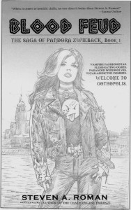
BFeud-SketchSo, loath as I am (not to mention embarrassed) to sketch out things for artists who are far better draftsmen than I, I picked up a pencil and started laying out my idea for Blood Feud. After a couple of days of trial and error, what you see here was the final result; click it to see it in its full horrifying glory. Still, it wasn’t too bad, I thought. The background is an obvious paste-up job, using a photo of NYC’s skyline as the background, but it got across the NY setting and “river of blood” element I wanted for the Hudson River—there were going to be vampires in the book, after all. And Pan stands in the foreground in what comic book fans would recognize as a traditional first-issue, here’s-the-star-of-the-series cover pose. Not the most action-packed image, but I wasn’t going for action so much as establishing Pan’s attitude. And it was still better than most mainstream publishers’ bland, extreme-close-up cover photos. So I sent it on to Bob, who, like most commercial artists, is appreciative of clients who know what they want—it spares the artist the teeth-grinding frustration of playing “I’ll know it when I see it” with clients who ask for multiple versions of a project before, more often than not, deciding that the first version was the right one all along.

BFeud-LarkinA few days later Bob e-mailed me his more realistic interpretation of my cartoony sketch (yes, you can click on this one, too). Sold! He’d subtly changed Pan’s body language and given her head more of a slight attitudinal tilt, and it was all perfect. I gave him the green light to take the sketch to the painting stage, and now all that was left was waiting for him to deliver the final art…

Except I suddenly realized I had a big problem in the making. See the design on Pan’s T-shirt—the bloody smiley face? That’s the look that Pan’s co-creator, Uriel Caton, came up with when he drew the first character sketches in 1998, and I thought it looked great—a T-shirt that had as much attitude as the girl wearing it. And so it remained for the next decade…until the first trailer for Warner Bros.’ movie adaptation of the DC Comics graphic novel Watchmen was released in 2008, and the studio got hit with a notice from a French corporation called The Smiley Company.

A little history, courtesy of Smithsonian.com: It turns out that, although the creation of the Smiley Face is attributed to American graphic artist Harvey Ross Ball, who designed it in 1963 for an advertising client, both parties never filed for a copyright or trademark and it dropped into public domain usage. Enter French journalist Franklin Loufrani, who in 1972 trademarked the image for his Smiley Company—which currently takes in more than $130 million a year for licensing rights.

Apparently no one at the studio had checked to see if an image that had become so identified with Watchmen, and so necessary to its plot—thanks to writer Alan Moore and artist Dave Gibbons—might have rights issues attached that needed clearing before the movie could be released. Oops. Nevertheless, an agreement was quickly reached that included the Smiley Company’s trademark language appearing in the film’s closing credits.

Well…good for Warner Bros., but bad for me, because Pan’s T-shirt needed to be redesigned immediately. Why get hassled by major corporations when I could take the easy way out? And so I set to work on finding a solution…

Next: Making with the cover design magic for the Blood Feud final cover.

Pandora Zwieback: The Evolution of a Series’ Covers

Last week, I covered the importance of having an editor involved in the creative process of writing a book’s manuscript, in a trio of posts found here, here, and here. But that’s just one part of what’s involved in putting together a novel for publication. Today, we start talking cover design.

Good stories are always essential, but from a sales point of view, one of the most important aspects of publishing is the cover. It’s the first thing a potential reader is going to see in a brick-and-mortar bookstore (unless it’s displayed spine-out on their shelves) or at an online retailer’s site, so it’s absolutely imperative that the cover be as eye-catching and intriguing as possible. The vast majority of small-press and self-published books often fail in that regard, choosing the laziest, most god-awful type-and-image designs they can throw together: photographs or paintings (or worse, silhouetted figures) that have nothing to do with the story; lettering taken straight from their computer’s font libraries; titles that are too long, or extremely pretentious, or head-scratchingly vague. (Truth be told, I’ve seen my fair share of books released by mainstream publishers that take the same approach.)

So in 2010, when it was time to transform StarWarp Concepts from a comic publisher to a book house, I knew that Job Two would involve using professional artists and designers to provide eye-catching covers (Job One was having quality stories to publish; can’t have the second without the first). The first person I approached was Bob Larkin, whose amazing cover paintings for Marvel Comics (Dazzler, Haunt of Horror, Vampire Tales, The Hulk!, Savage Sword of Conan the Barbarian, Crazy) and Bantam Books’ Doc Savage pulp-fiction reprints had created a fan base that included such luminaries as Alex Ross, Joe Jusko, John Romita Sr., Jim Steranko, and Larry Hama. I’ve been a fan myself, all the way back to the ’70s, and was thrilled when, in 2000, he agreed to paint the covers for my X-Men: The Chaos Engine Trilogy novels—and overjoyed when he did three cover paintings for SWC’s succubus character, Lorelei. This time, however, I wanted him to paint the covers for a series about a certain teenaged Goth chick.

LarkinArt02

Explaining the gothy nature of Pan took a bit of doing, since it’s outside the range of anything Bob had ever painted before, but he had two advantages going in to the project: Pan had already been designed by my creative partner, Uriel Caton; and Bob has an extensive history of painting horror-related images, from monster magazine covers for Marvel and Warren Publishing to monster movie posters for New Line Cinema, United Artists, and Troma Films (among other studios)—Piranha, Night of the Creeps, Humanoids From the Deep, and The Toxic Avenger II are just some of the poster images he’s created.

But why use painted covers? you ask. Why not go with a photograph of a model dressed as Pan? That’s what all the major publishers would do. And that’s the problem, because when all the major publishers do the same thing, they create a uniform look for an entire genre of books that’s extremely generic and boring. (To get an idea of what I’m talking about, check out this post about photo covers that I wrote back in 2011.) I wanted Bob Larkin originals for Pan’s series, and that’s exactly what I was gonna get. All I needed to get the process started was to show Bob what I had in mind…

Next: Creating the cover for Blood Feud, the first novel in Pan’s saga.