
 Back on June 1st I told you about the start of the creative process behind the cover art for Blood Feud, the first Pandora Zwieback novel: I commissioned painter Bob Larkin to bring Pan to four-color “life,” then sketched out what I was looking for, and not too long after Bob delivered a final sketch that I approved. And then I realized that the bloody smiley face image on Pan’s T-shirt would have to be redesigned, or potentially risk drawing the ire of a French company that’s owned the smiley face trademark since 1972. But what could replace that iconic image? Well…what about a brand-new image?
So I pulled out my drawin’ pencil again and started sketching. I wanted to retain some elements from Uriel Caton’s design, so the Band-Aid across the “nose,” the crosshatched bruise, and the stuck-out tongue stayed; now I just needed a face to put them on. Then the idea struck me: how about the head of a devil girl? Bright-red skin and horns, a pageboy hairstyle, and bright-green eyes would go really well with those “I just got in a fight, so what?” elements. In no time at all I had a design I liked, and e-mailed it to Bob for him to give it a professional finish. Thus was the Official Pandora Zwieback T-shirt born! (Which, by the way, you can purchase from the StarWarp Concepts webstore.)
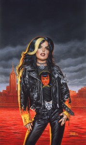 Now it was on to the actual cover painting, and when Bob was finally able to clear his busy schedule he got right to work, and the result is what you see here. Nice, huh? I had just one problem with it: there was too much red in the background. The concept I’d handed to Bob was that the Hudson River behind Pan—we’re looking at Manhattan’s West Side from New Jersey, for those who were wondering—was supposed to be a river of blood; making the skyline just as red worked against it. Bob’s rationale was that sunlight reflecting off a bloody river would “paint” the buildings red, which I could understand, but still…no. I’d rather have the bloody Hudson made as unsubtle as possible.
So I turned to Mat Postawa, the series’ book designer (and part-time metal head), to ask what could be done. Like Bob, I’ve known Mat—and SWC’s other genius book designer, Mike Rivilis—for years, having worked with him in the trenches of publishing house ibooks, inc., when I was its editor-in-chief. As I explained to Mat, for the Pan series I wanted a distinctive look for the cover designs that would appeal to both teenagers and Goths, but would also draw the eye of a general book buyer curious about the novel’s content. “You’re already familiar with the kind of audience I’m trying to reach,” I told him. “So take your best shot. And, uh, can you do something about those red buildings in the background?”
After a few rounds of give-and-take, each one better than the last, this was the look we settled on:
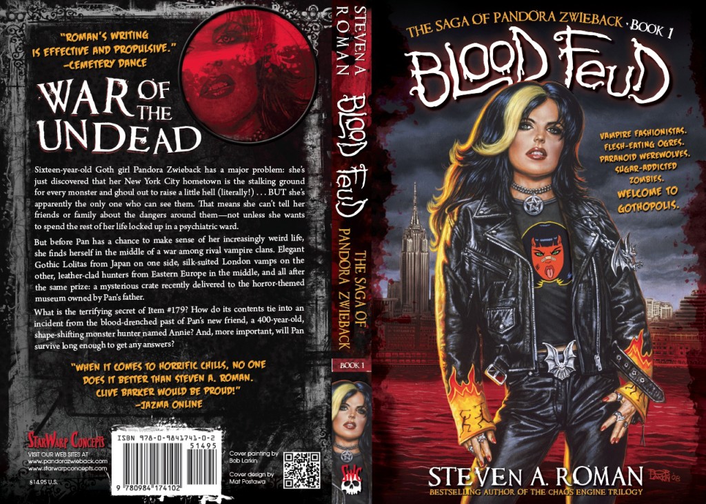
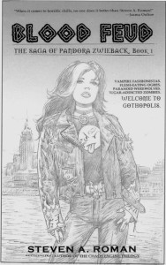
You couldn’t ask for a better cover! Mat adjusted the buildings’ color; deepened the background and added a hint of blood splash to the edges to make Pan stand out brighter; and even hand-lettered the Blood Feud title. Having Pan on the spine was my idea—for any self-publishers out there, it’s always good to keep in mind that your book might show up spine-out on a store’s or library’s shelves, so an eye-catching graphic is essential. I also wrote the back cover copy, and thanks go out to Mike Rivilis, who, after looking at the first-pass design, remarked that I’d overwritten the copy—there were originally four paragraphs. And since Mike has a long history of designing covers for young adult novels (two examples being Daniel Parker’s Countdown and Francine Pascal’s Fearless series), I listened when he said there shouldn’t be more than three paragraphs on a YA cover. He was right—it makes for punchier text.
“Lock it in!” I told Mat. “This one’s a keeper!”
So, there you have it: the story of Blood Feud’s cover, from first sketch to final design—just as action-packed as you’d expected it to be, right? 😉
Next: Creating the cover for Blood Reign, the current novel in Pan’s saga.
Pingback: Pandora Zwieback: Son of Designing Book Covers | StarWarp Concepts