Wow, talk about getting sidetracked! When I wrote the introductory post for this discussion of cover designs, back in March, I didn’t know I was going to about to get caught up in a ton of freelance assignments, mixed with a barrage of promotional work (interviews, mailing out press kits and review copies, etc.) to help get the word out on Blood Reign: The Saga of Pandora Zwieback, Book 2 (on sale now, of course). Let’s recap and pick up where I left off, okay?
In 2008, I’d decided to resurrect StarWarp Concepts after an absence of three years, and turn the company into a book-publishing house, rather than just a home for my comic projects. It also meant a switch in a company focus from the Mature Readers character Lorelei—a succubus I’d created in 1989, and the star of SWC’s first comic series—to something more inclusive of a wider readership. To do that, the first project for the revived SWC would be The Saga of Pandora Zwieback: a young-adult, dark-urban-fantasy novel series I’d shopped around to major publishers for a couple of years, with no success. I still had plans for Lorelei, and for adding more titles to the budding release schedule, but Pan was going to be the new face of The ’Warp—and she was going to make her debut at the 2010 New York Comic Con, where I’d let the world know that StarWarp Concepts was back, better than ever.
There was just one thing, though: I needed a graphic to show off to the con-goers; I needed a banner to hang from the back of the booth. But in order to fashion that banner, I needed images to display—specifically Pandora Zwieback images. Which meant that first I’d have to commission cover art for books 1–3 in the series: Blood Feud, Blood Reign, and (originally) Stalkers. And there was only one artist I had to mind to tackle that assignment: Bob Larkin.
If you’ve been reading this blog for a while, by now you should be familiar with Bob Larkin—I’ve certainly written about him often enough! But if you’re still unfamiliar with his work, here’s a small sampling of what he’s painted:

Marvel Comics: covers for Dazzler, Star Trek: The Motion Picture, Star Wars, Episode V: The Empire Strikes Back, Close Encounters of the Third Kind, Jaws 2, Battlestar Galactica, Savage Sword of Conan the Barbarian, Tomb of Dracula, Haunt of Horror, Planet of the Apes, Crazy, and The Hulk!
Warren Publishing: covers for Creepy, Eerie, Famous Monsters of Filmland, The Rook, Warren Presents: Pantha the Panther Girl, and Vampirella
New World Pictures, Pathé, TriStar Pictures, Troma Studios, United Artists: movie posters for Heaven’s Gate, Humanoids From the Deep, Night of the Creeps, Piranha, Piranha II, Terror Train, The Toxic Avenger Part II, Troma’s War
So, y’know, the guy knows how to paint. And that doesn’t even count the hundreds of book covers he’s provided to numerous publishers, most notably his run of Doc Savage covers for Bantam Books (and for my own X-Men: The Chaos Engine Trilogy novels, from BP Books/Simon & Schuster). So when I outlined my plans to Bob, he immediately jumped on board. All he needed was for me to show him what I was looking for.
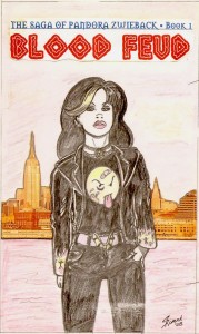 So, loath as I am (not to mention embarrassed) to sketch out things for artists who are far better draftsmen than I, I picked up a pencil and started laying out my idea for Blood Feud. After a couple of days of trial and error, what you see here was the final result; click it to see it in its full horrifying glory. Still, it wasn’t too bad, I thought. The background is an obvious paste-up job, using a photo of NYC’s skyline as the background, but it got across the NY setting and “river of blood” element I wanted for the Hudson River—there were going to be vampires in the book, after all. And Pan stands in the foreground in what comic book fans would recognize as a traditional first-issue, here’s-the-star-of-the-series cover pose. Not the most action-packed image, but I wasn’t going for action so much as establishing Pan’s attitude. And it was still better than most mainstream publishers’ bland, extreme-close-up cover photos. So I sent it on to Bob, who, like most commercial artists, is appreciative of clients who know what they want—it spares the artist the teeth-grinding frustration of playing “I’ll know it when I see it” with clients who ask for multiple versions of a project before, more often than not, deciding that the first version was the right one all along.
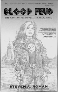 A few days later Bob e-mailed me his more realistic interpretation of my cartoony sketch (yes, you can click on this one, too). Sold! He’d subtly changed Pan’s body language and given her head more of a slight attitudinal tilt, and it was all perfect. I gave him the green light to take the sketch to the painting stage, and now all that was left was waiting for him to deliver the final art…
Except I suddenly realized I had a big problem in the making. See the design on Pan’s T-shirt—the bloody smiley face? That’s the look that Pan’s co-creator, Uriel Caton, came up with when he drew the first character sketches in 1998, and I thought it looked great—a T-shirt that had as much attitude as the girl wearing it. And so it remained for the next decade…until the first trailer for Warner Bros.’ movie adaptation of the DC Comics graphic novel Watchmen was released in 2008, and the studio got hit with a notice from a French corporation called The Smiley Company.
A little history, courtesy of Smithsonian.com: It turns out that, although the creation of the Smiley Face is attributed to American graphic artist Harvey Ross Ball, who designed it in 1963 for an advertising client, both parties never filed for a copyright or trademark and it dropped into public domain usage. Enter French journalist Franklin Loufrani, who in 1972 trademarked the image for his Smiley Company—which currently takes in more than $130 million a year for licensing rights.
Apparently no one at the studio had checked to see if an image that had become so identified with Watchmen, and so necessary to its plot—thanks to writer Alan Moore and artist Dave Gibbons—might have rights issues attached that needed clearing before the movie could be released. Oops. Nevertheless, an agreement was quickly reached that included the Smiley Company’s trademark language appearing in the film’s closing credits.
Well…good for Warner Bros., but bad for me, because Pan’s T-shirt needed to be redesigned immediately. Why get hassled by major corporations when I could take the easy way out? And so I set to work on finding a solution…
Next: Making with the cover design magic for the Blood Feud final cover.
Pingback: Pandora Zwieback: Designing Book Covers | StarWarp Concepts
Pingback: Pandora Zwieback: Creating Blood Feud’s Cover, Part 2 | The Saga of Pandora Zwieback
Pingback: Creating the Pandora Zwieback #0 Cover, Part 1 | The Saga of Pandora Zwieback